02 Oct The Moodboard
DESIGN
THE MOODBOARD
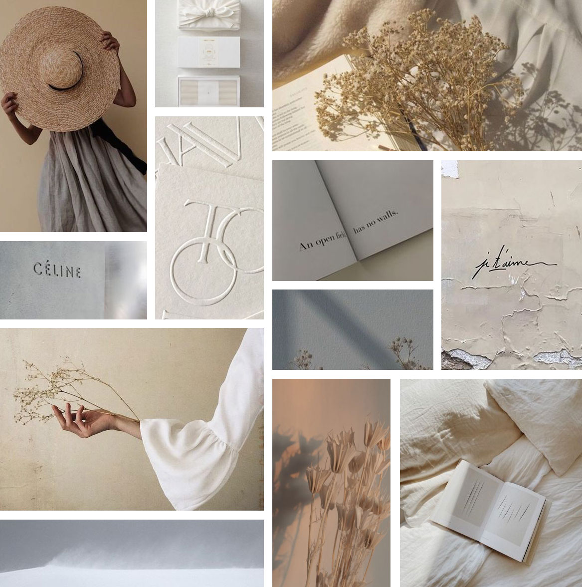
When we create a moodboard for our clients, we curate visual inspiration that includes colours, images, type, text, photos, textures, or any other kind of visual inspiration that encompasses what the brand represents and the kind of message they want to push out into the world. Every element plays an important role while contributing to the impact of a greater whole.

All images sourced via Pinterest.
The moodboard is included as part of the visual strategy and helps the designer and the client to get on the same page. It’s where things begin to get exciting for our clients as they start to envision their brand and how it reflects who they are as a brand.
Every element plays an important role and contributes to the greater whole.
We create this after the discovery phase and several phases ahead of concepts and before we roll up our sleeves and get to working on actual designs.
In the future, we’ll break down each of the elements of a moodboard in different posts. But for now, let’s focus on colour. Colour has an effect on our psyche. Colour is light and energy. It’s visible because it reflects, bends and refracts through all kinds of particles, molecules and objects. It’s also an expression of our personality. Think about colours you choose to wear, or the colours you surround yourself with in your interiors. It influences our emotions and state of mind. Some might irritate you or on the opposite side of the spectrum feel relaxing and calming. Different seasons bring out various hues in nature. Is there a season that feels the most comforting or exciting to you? A lot of that may very well have to do with seeing colours. And so when it comes to branding, colour psychology plays an important role for all these reasons and more.

THE COLOURS
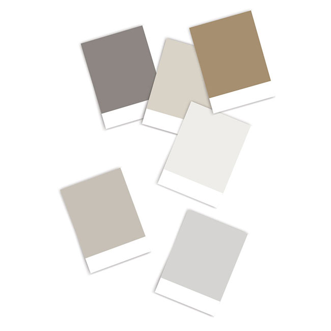
A neutral palette of tans, greys, whites | Refined, Minimal, Simplicity, Easy, Warm, Calm, Quality, Timeless, Comforting, Natural.
It’s important in the moodboard to show not just the flat colours, but images that might help envision how the colours will look in natural and artificial lighting, demonstrated with shadows and highlights. Because aside from digital use, once those brand colours are out in the wild, they’re always playing against different sources of light. Think tacticle elements such as stationery, packaging, signage, environmental designs, etc.
Most of the time, the moodboard once presented is met with a resounding ‘yes!’ We’re able to get there because of all the conversations and the discovery sessions. But other times we spend additional time to carefully get it right, tweaking the elements well beyond the concept stage or finalizing as we get into the design phase. The moodboard is more than a pretty collection of images. It really does act as our inspiration, and part of the roadmap to successful brand identity design.


