RAZZLE RESOURCES
OBJECTIVE/SOLUTION
Create an exciting identity and story for a mining and mineral resources business that balances expertise and knowledge with a playful spirit.
SERVICES
Brand Identity
Naming
Brand Messaging
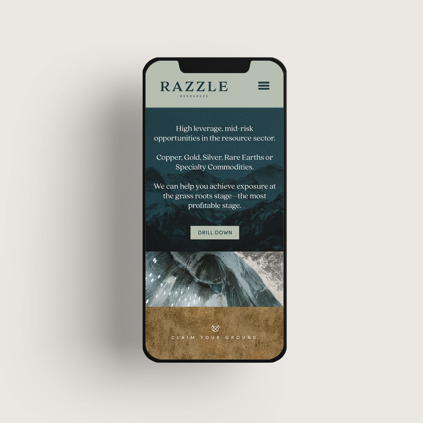
Website (coming soon)
LOCATION
Ontario, Quebec, British Columbia, Yukon
INDUSTRY
Mining & Mineral Resources
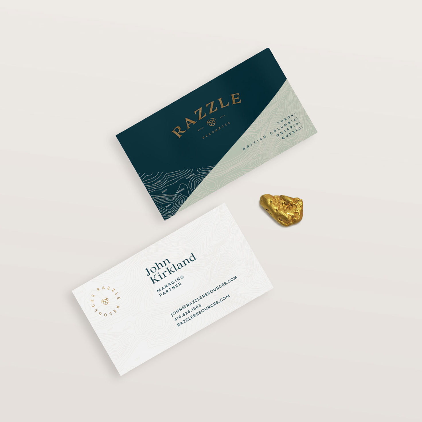
Razzle Resources: A play on ‘Razzle Dazzle’ – “Noisy, showy, an exciting activity.”
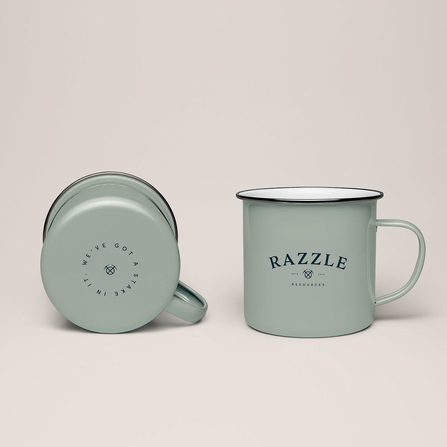
It was pure joy to create a brand for a client with a great sense of humour! They wanted some light-heartedness infused in their brand for an industry that can sometimes take it self too seriously. From the name to some of the brand elements, their playful side shows off.
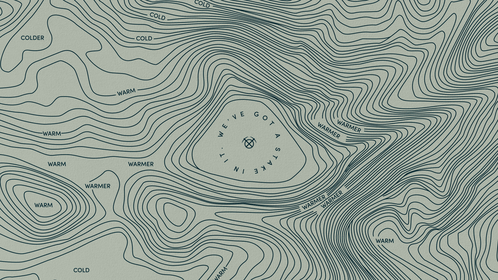
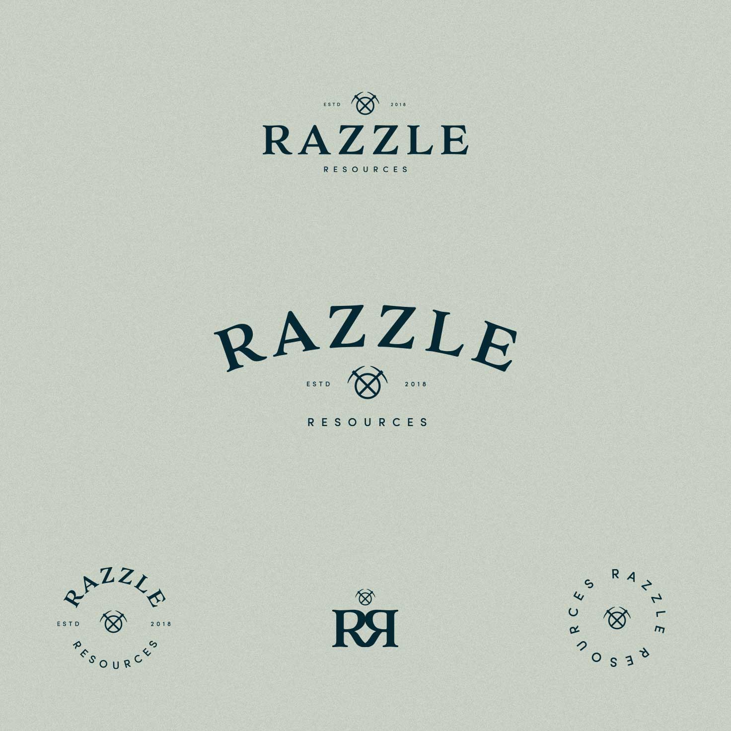
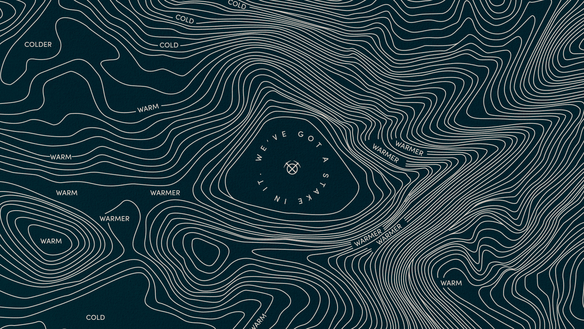
The contour map brand pattern is a fun nod to the child’s game “you’re getting warmer” (becoming closer to discovering something). But the brand is not all glitz and games… Our client is a resourceful, treasure trove of knowledge, excellent researcher and expert in their industry, which is why the foundation of the design uses a timeless colour palette and strong serif style letterforms to bring the full brand meaning to life and stand out above the rest.
