GOLFI TEAM & GOLFI LUXURY

OBJECTIVE/SOLUTION
Refresh and evolve the identity for a growing team of real estate professionals on a mission to deliver world-class marketing and client service.
SERVICES
Brand Identity
Consulting
Brand Collateral
Brand Guidelines Development
Creative Direction
INDUSTRY
Real Estate
LOCATION
Hamilton, Burlington, Grimsby, St. Catherines, Niagara Falls, ON

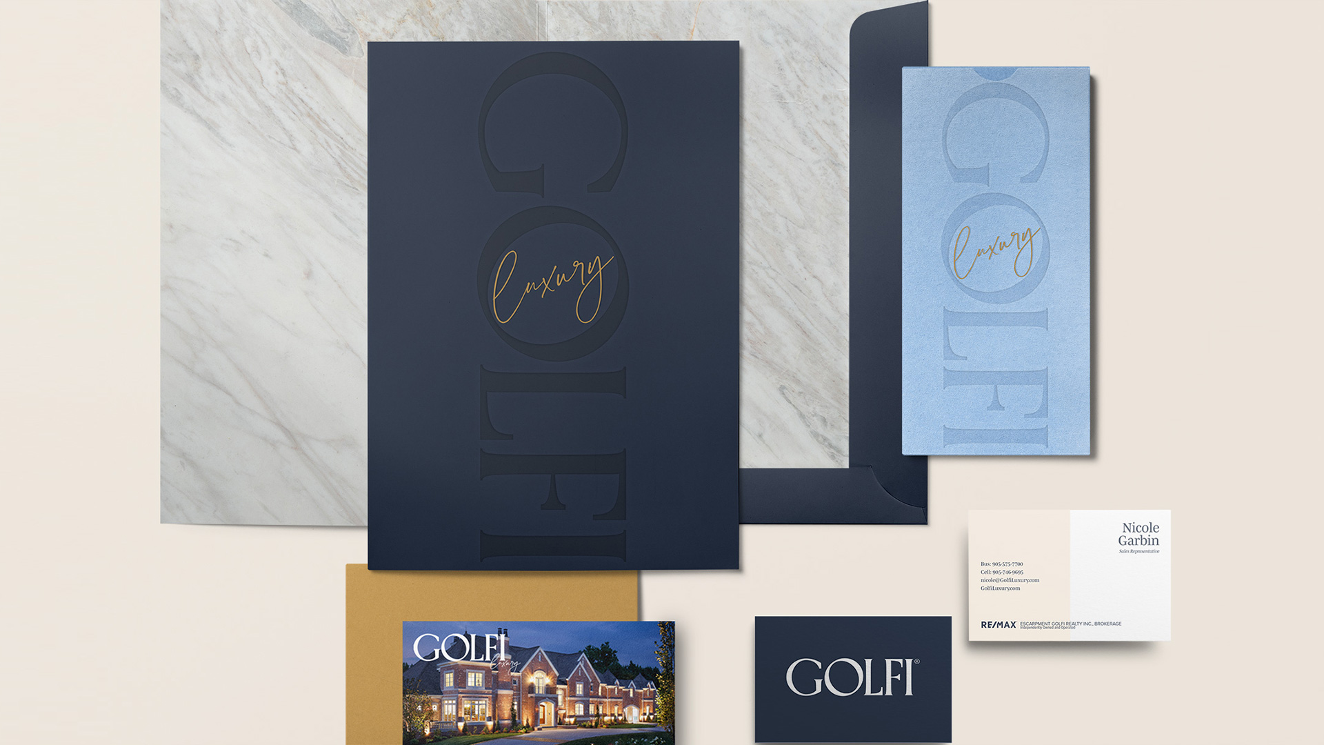
The logo’s letterforms are a modern take on a traditional serif style that marries bold and youthful with a timeless and sophisticated aesthetic. The primary wordmark is short enough in length to read well on various dimensions in both digital and print. It rotates easily into a tower version where we can place the descriptor name to be housed creatively in the O, making the logo suite more dynamic.


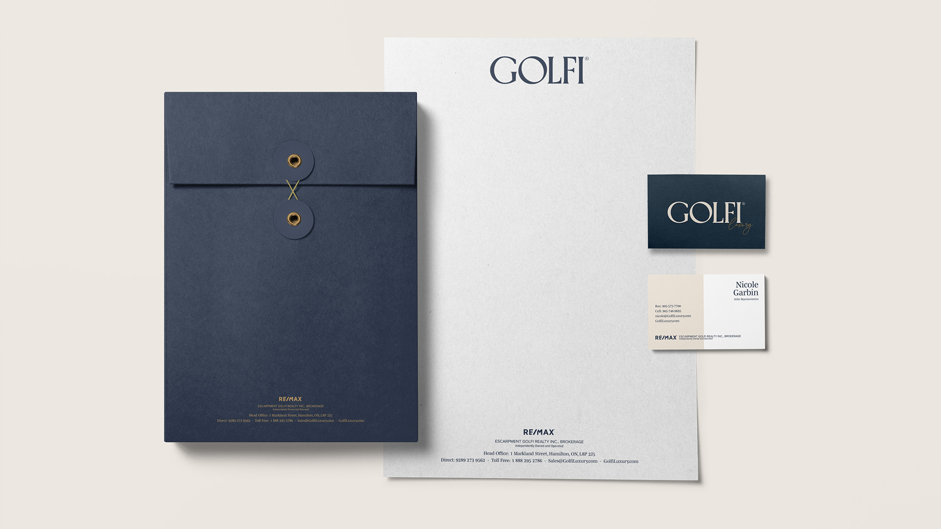
The colour palette utilizes a contemporary take on traditional hues of navy, gold, blue and natural tones to reflect a sense of trust and confidence their clients will feel when Golfi is at the helm navigating their real estate dealings and decisions.
The brand elements and new typography bring the design to life and create a flexible system that translates beautifully across all touch points from print collateral such as business cards, stationery, presentations, ads and signage to websites and social channels.

One of the desires Golfi communicated to us was to standardize their branding. We developed a comprehensive guidelines book to help manage the use of assets and reinforce consistent application of all the elements. With a business such as a real estate company where most marketing materials are handled through their in-house marketing department, this is valuable toolkit to help them be consistent with their brand, but with enough freedom to be creative and have fun. Because we firmly believe using your brand assets should be a joyful experience!


