Aroon Beverages
OBJECTIVE/SOLUTION
Craft a captivating brand identity and packaging system for ready-to-drink non-alcoholic daytime (or anytime) cocktails that bring joy and positivity to your day.
SERVICES
Brand Strategy
Naming
Brand Identity
Creative Direction
Packaging Design
INDUSTRY
Food & Beverage
LOCATION
Toronto, Canada
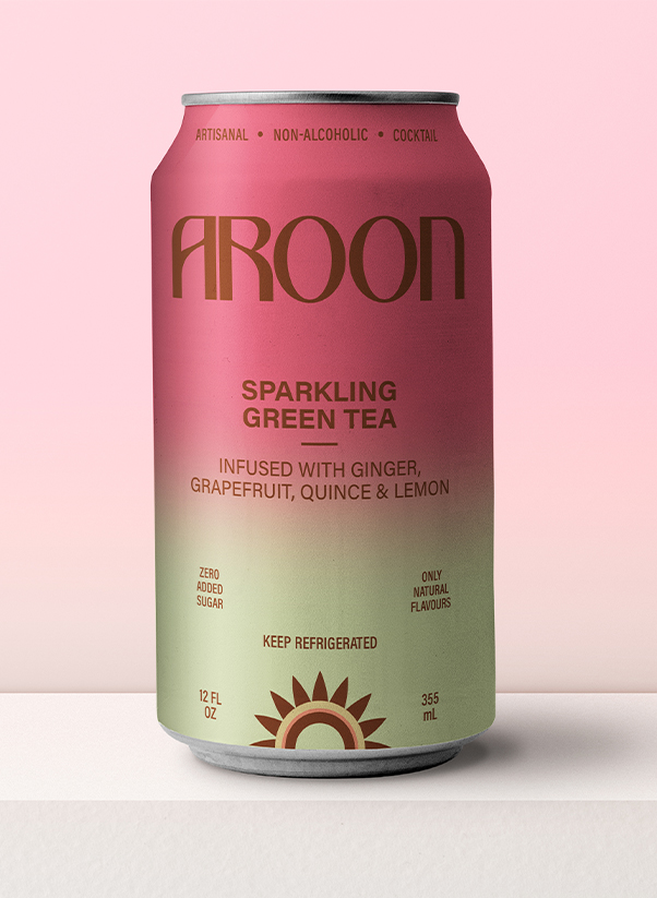
Aroon: To be enjoyed ‘around noon’ (or any time of day…)
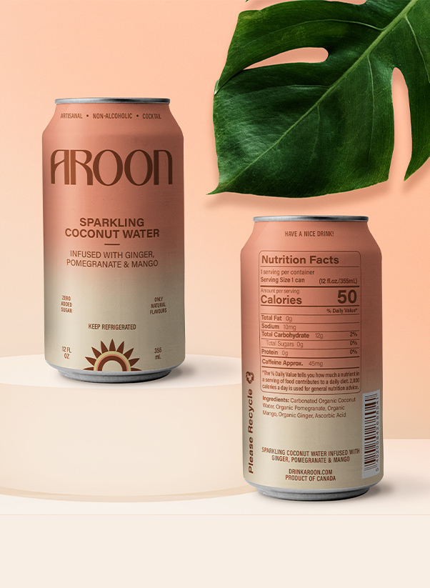
Aroon is a Thai name meaning ‘dawn’. The makers of Aroon wish to bring their Modern Thai-inspired crafted fusion beverages in a convenient, ready-to-go can to start your day off sparkling! Though these artisanal drinks are certainly delicious at any time, day or night.
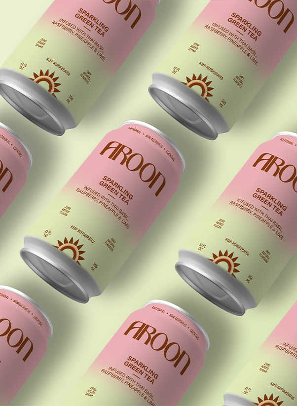
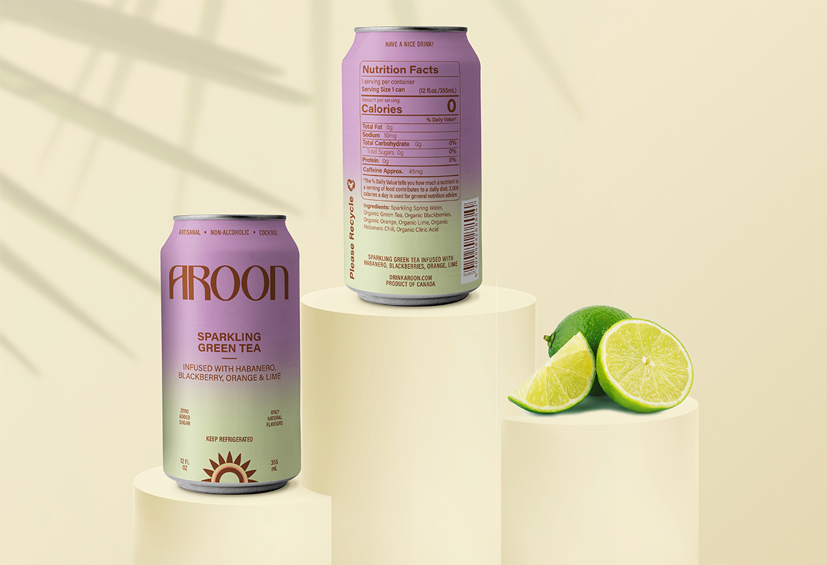
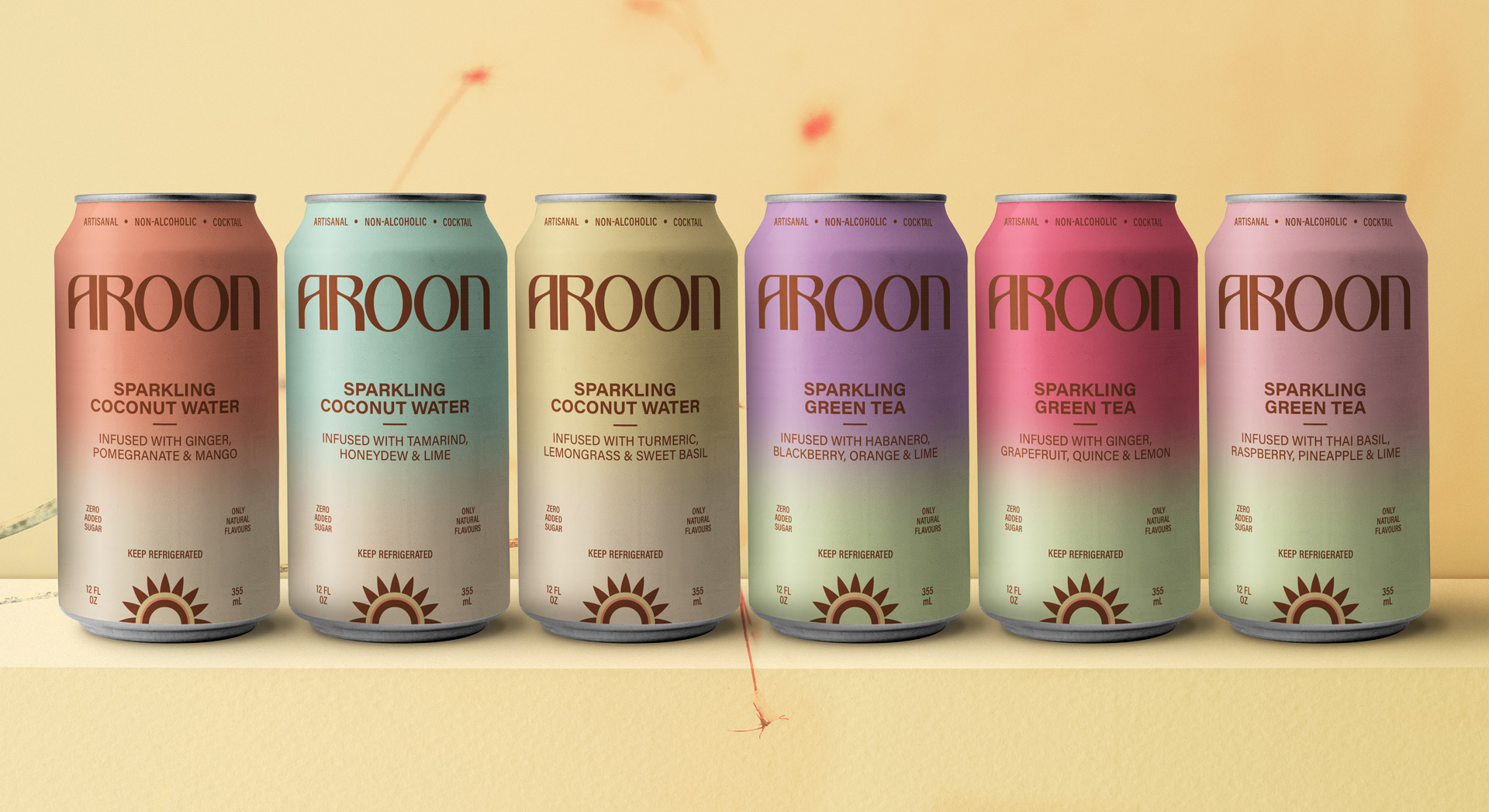
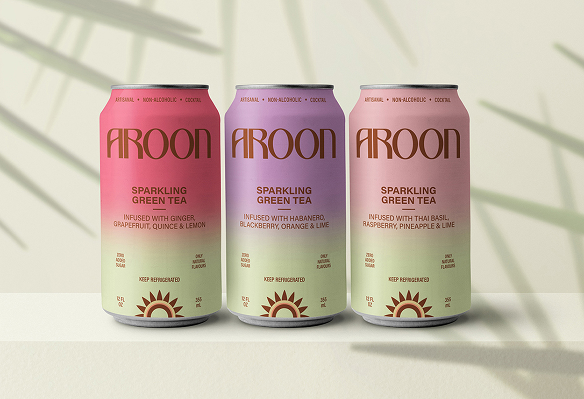
Three products use sparkling green tea as a base, and three use sparkling coconut water. All are artfully infused and mixed for a light, refreshing option as a non-alcoholic cocktail to be consumed guilt-free as early as you rise, or whenever you need a pick-me-up or reason to celebrate!
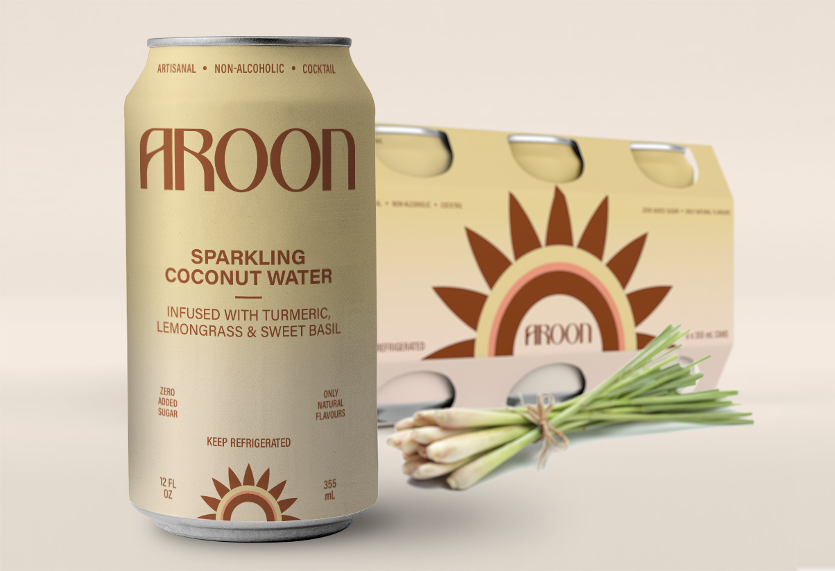
With flavours ranging from Turmeric, Lemongrass & Sweet Basil to Ginger, Grapefruit and Quince, the artisans at Aroon hope to surprise and delight in each can, and with every sip. They passionately wish to bestow more joy and positivity to everyone. In fact, they mentioned several times that they hope their artisan drinks would help people to have a nice day – or as we began to say, have a nice drink! The latter became a tagline used on the back of the can as another delightful little nugget in the whole Aroon drink experience.
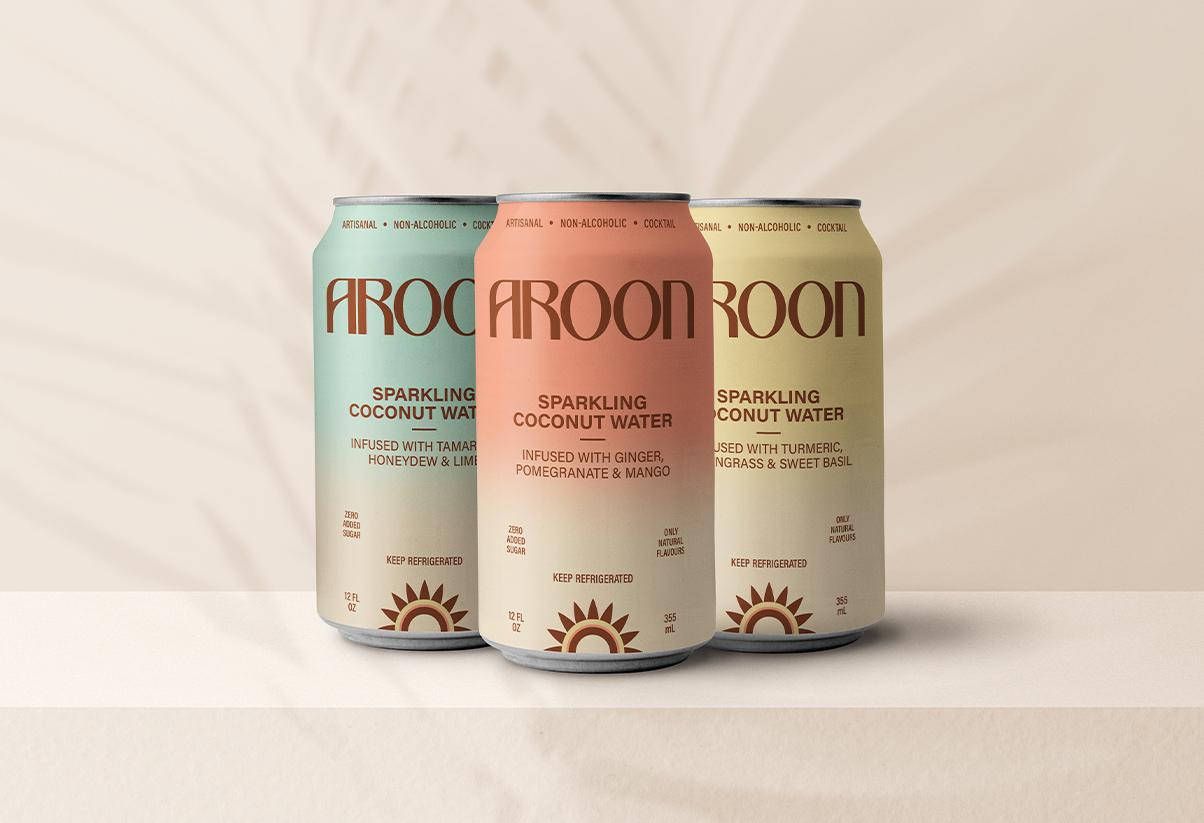
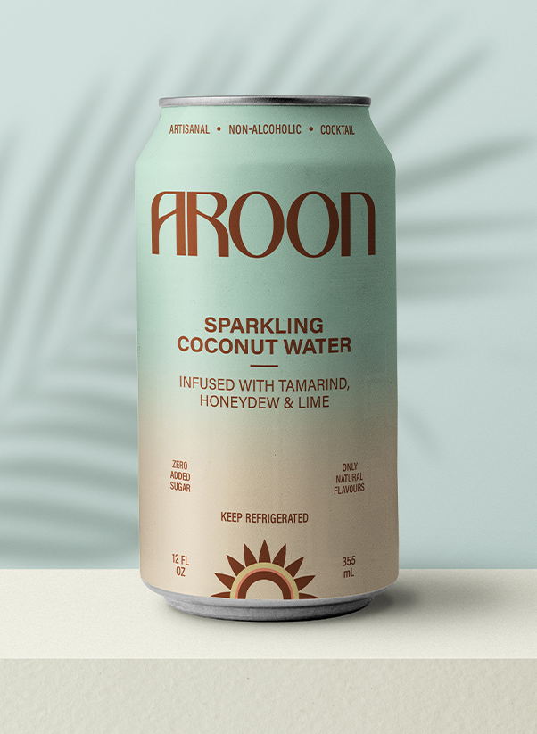
While the infusion process is a complex method, the ingredients are pure and simple. Our inspiration was sparked by hours of conversations, and witnessing the crafting process so we wanted the brand and package design to embody this essence. The colour palette was created from a custom mix of the tones in the ingredients and blend into a milky white for the coconut base, and a fresh pale green for the tea base. These gradients became the backdrop for the can design and in keeping with the entire brand experience we wanted to convey: sparkling, fusion, pure, simple, joy. Now ready to launch–Cheers Aroon!
