WELLSPRING SUPPORT
OBJECTIVE/SOLUTION
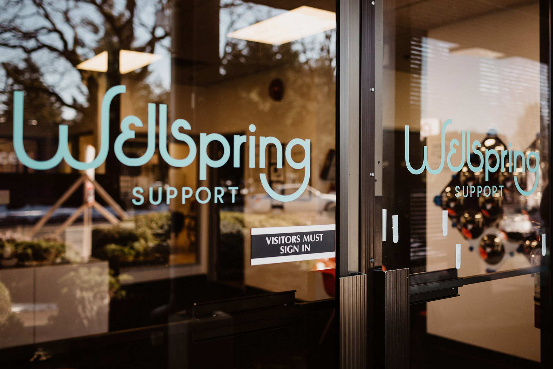
Craft a meaningful identity, brand design and website for an organization that values inclusion, diversity, and equality.
SERVICES
Brand Strategy
Brand Identity
Iconography
Brand Messaging
Website Development
Business Card Design
LOCATION
Victoria, British Columbia
INDUSTRY
Community inclusion services for adults with diverse abilities
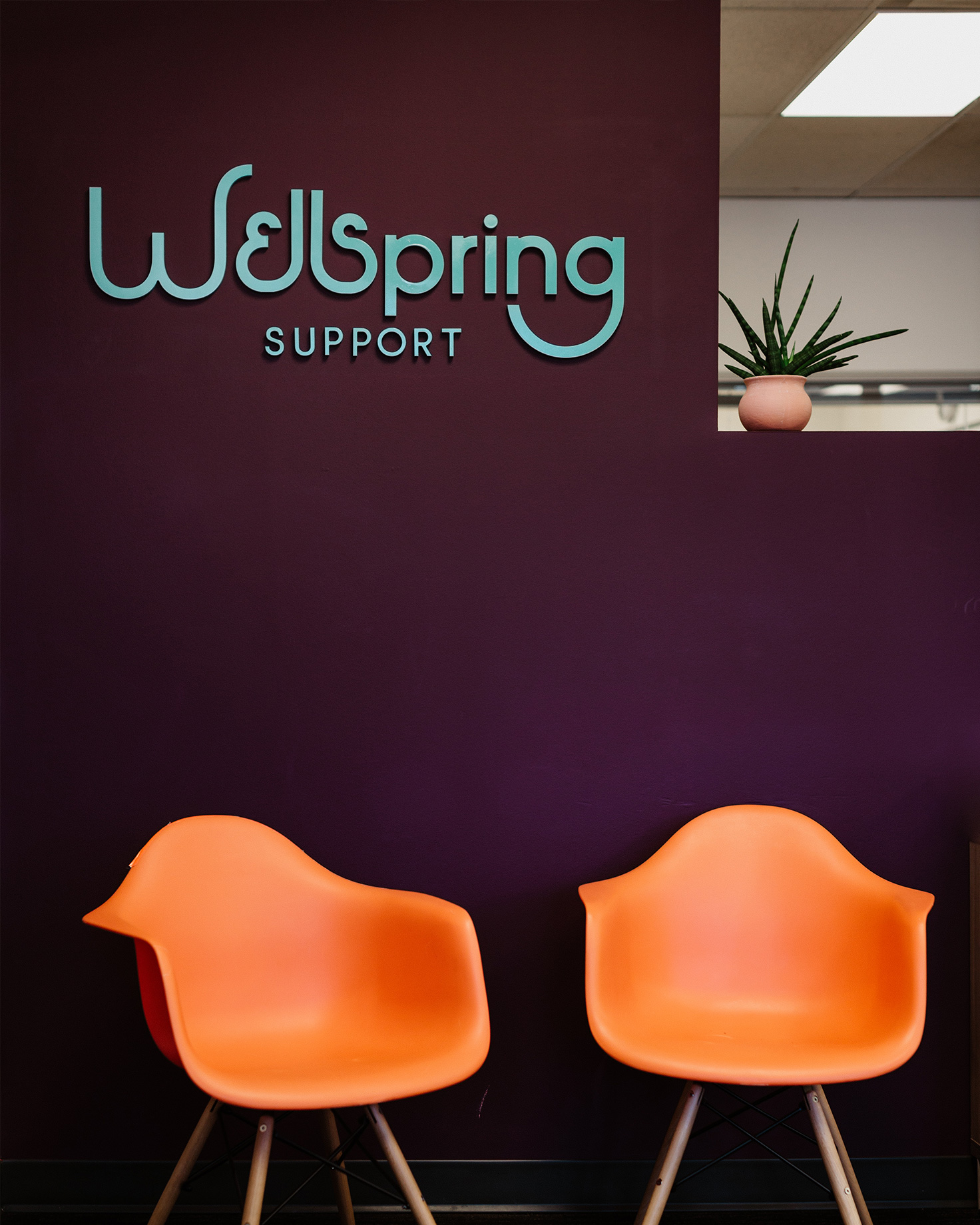
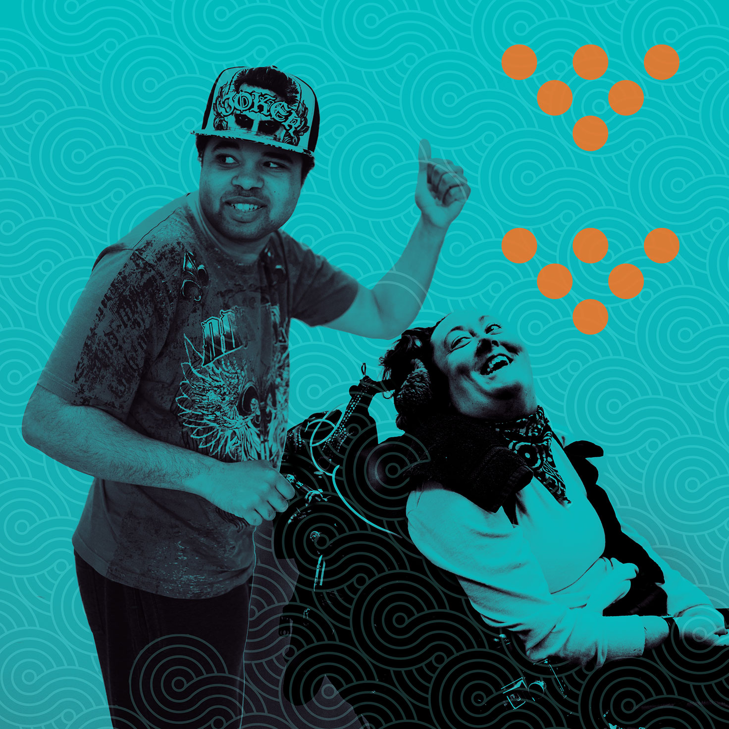
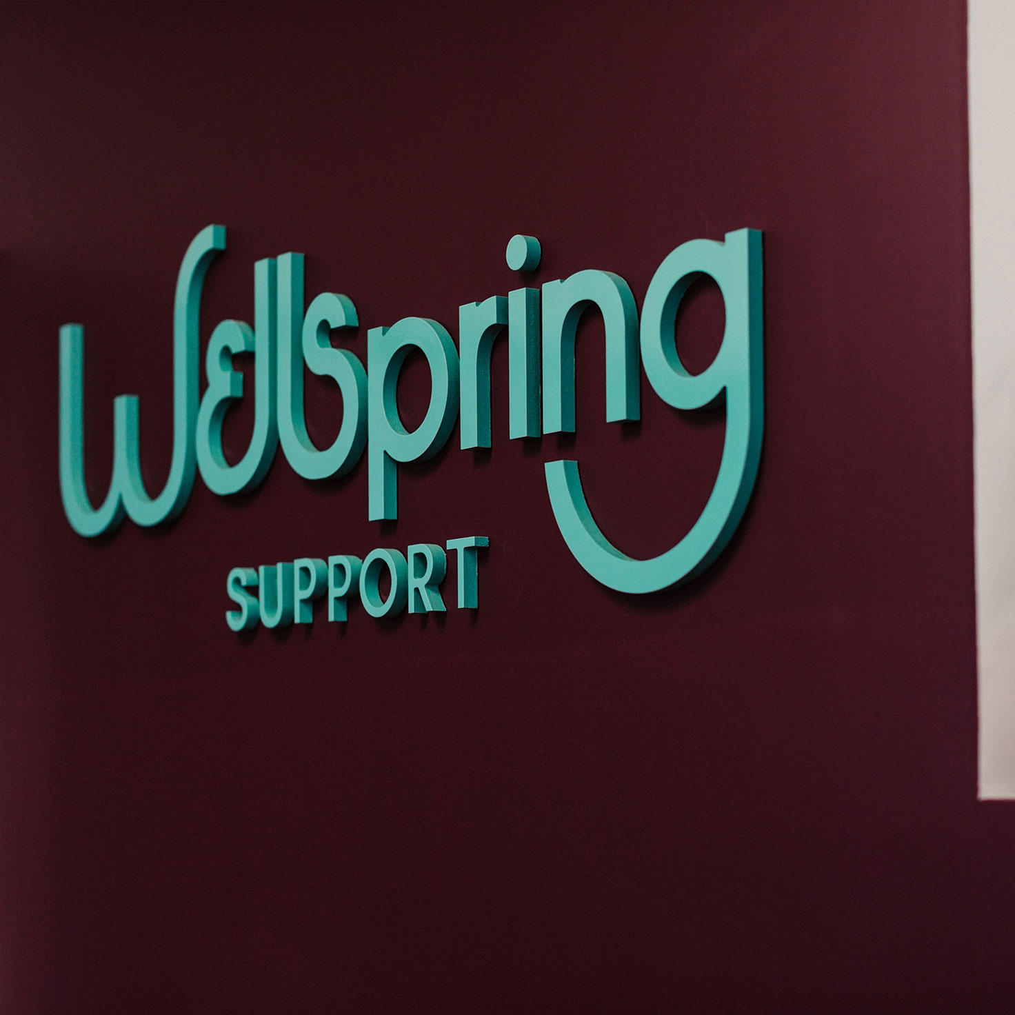
Wellspring’s visual and verbal language was inspired and guided directly by their value system. Iconography was developed to further interpret their core mantra: “We celebrate diversity. We stand for equality. We are included. We are Wellspring – people come first here.” The joyful and robust colour palette, the patterns and the imagery celebrate and interpret the heart and soul of this brand.

Wellspring Support is a CARF-accredited organization providing community inclusion services for adults with diverse abilities. They offer comprehensive programs tailored to fit the individual needs and healthcare plans of their participants, including providing support with mobility, individualized communication, and personal care. Wellspring is where people come first and we were proud to work with this amazing group of individuals!
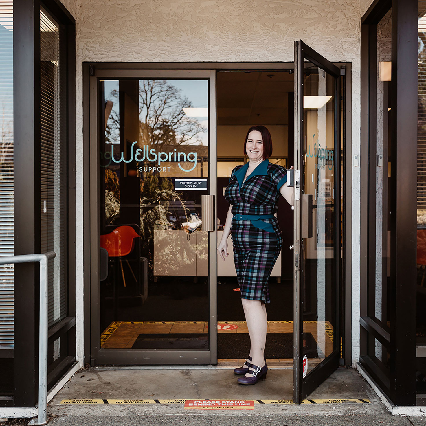
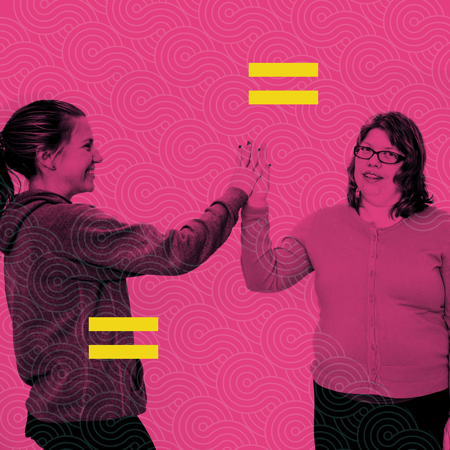
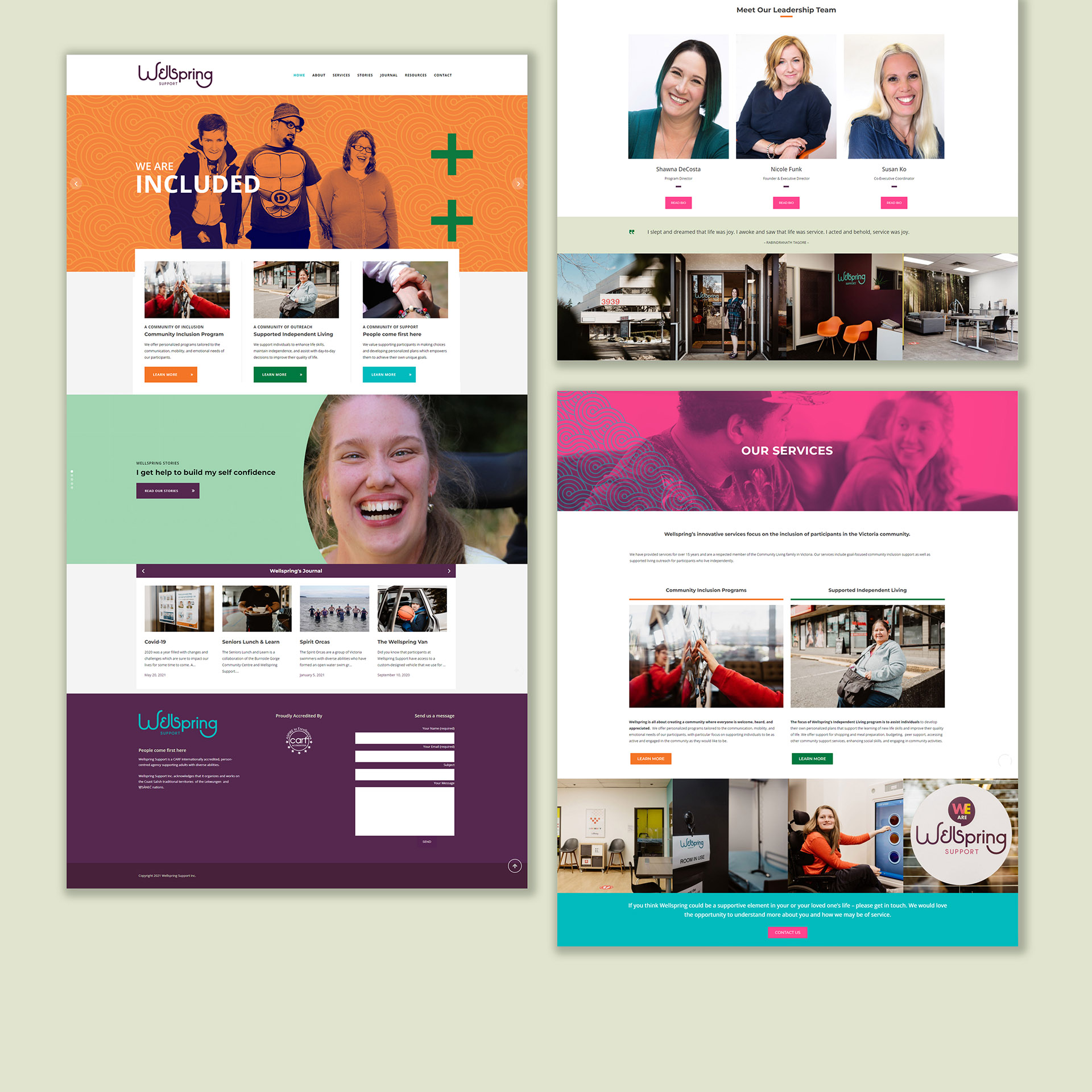
We designed and developed a website that allows the visitor to peruse services and reporting, but also an inside look at what they can come to expect at Wellspring Support. This is a joyful space, a creative space, an inclusive space and community where all are welcome, supported and valued. A host of galleries provides a tour of the community center and the supported independent living services. The journal and Wellspring stories offer more insight on the wide range of activities and first-hand testimonials.
TESTIMONIAL
From our collateral to our website and how it unfolds into our space, I could have never dreamed up our amazing branding and feel so fortunate to have worked with someone who is at the top of their field! Stacey brought out the best in us and actually helped strengthen our roots and helped us to figure out who it is we are. We are grateful, and so proud of our brand!


